OiA
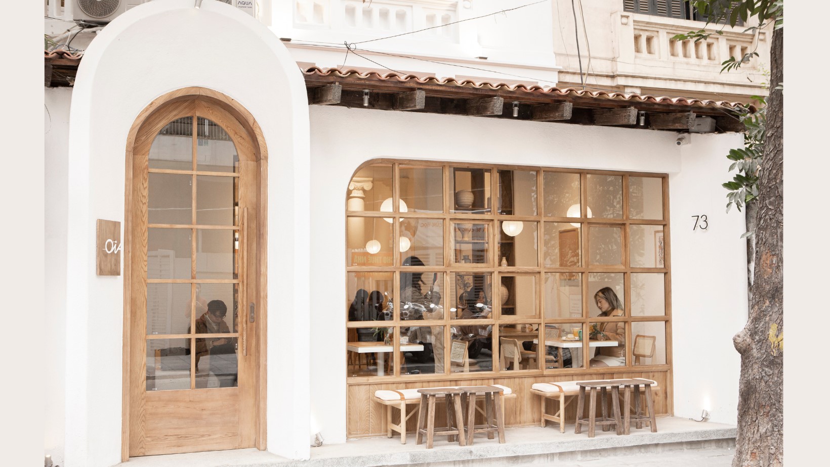
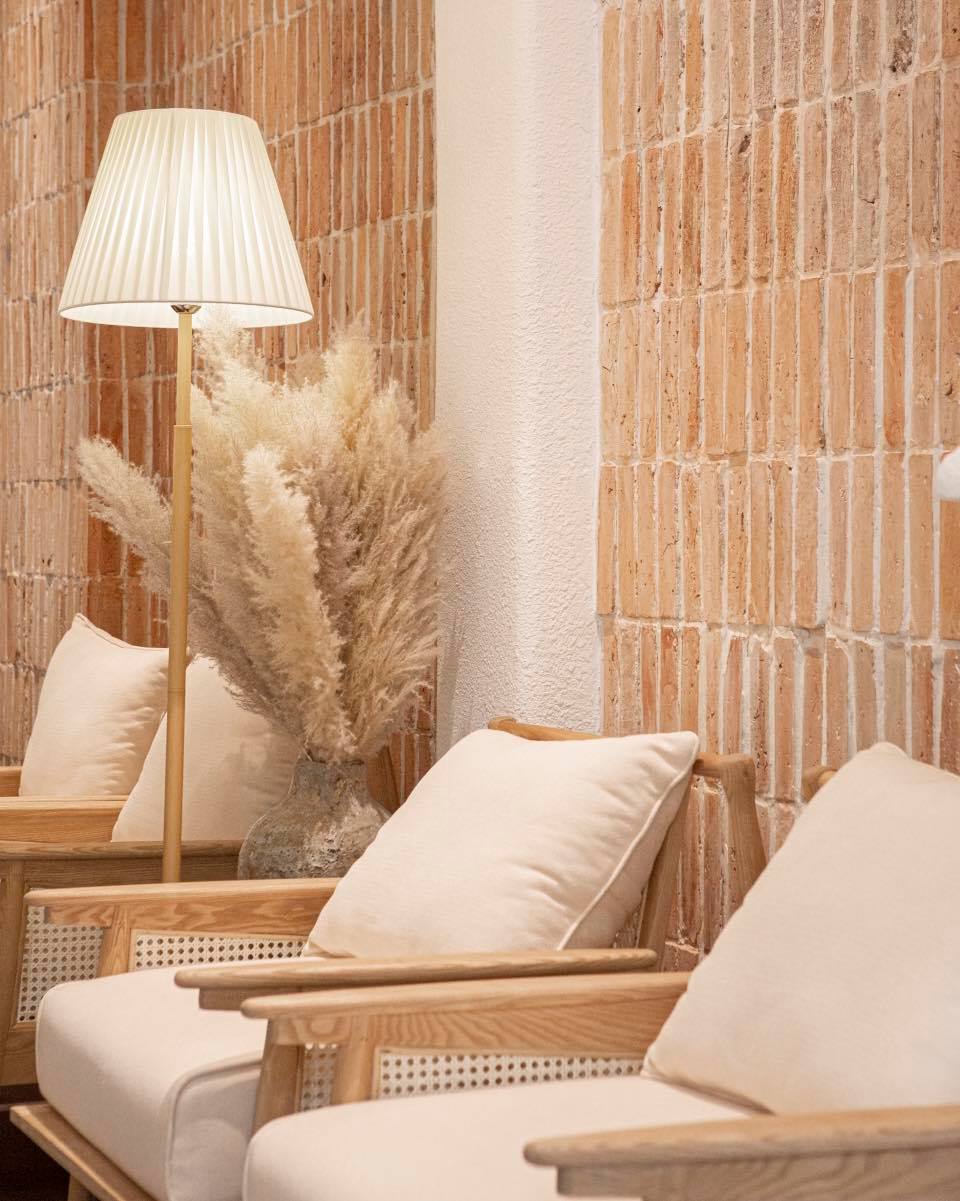
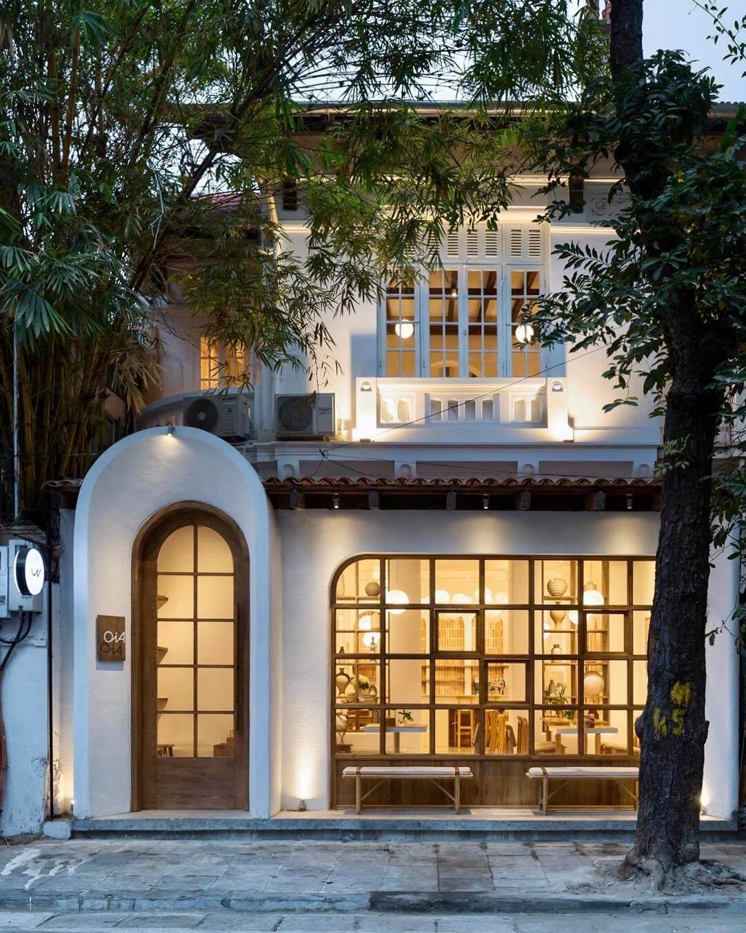
The name “OiA” originates from a village in beautiful Santorini, which inspires the cafe’s architectural style. In Vietnamese, OiA goes beyond. It can be “oi ả”, glaring heat in the summer solstice. It can also be “ơi à”, soft like a hummed lullaby. With refreshing drinks and gourmet pastries, OiA soothes our soul when it’s too hot outside. At OiA, customers find themselves a comfortable space to sip on coffee and enjoy their quiet hideout in busy Hanoi.
Year
2021Scope
Identity System, Brand Positioning, Branded CollateralsTeam
Design: Dakota Nguyen, Hoang Hiep, Colin TranPhotography: Courtesy of OiA
Concept
My objective when creating the visual identity for OiA was to craft an elegant and refined look that can still resonate with younger customers. Soft-spoken, joyful and honest is the tone.
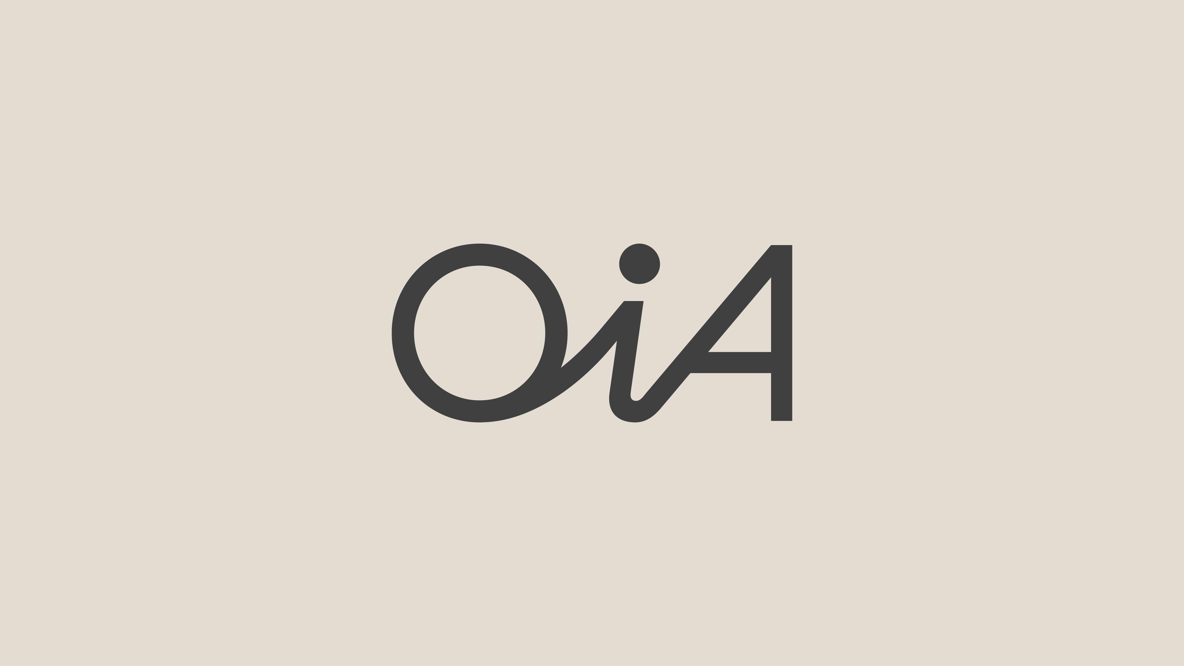
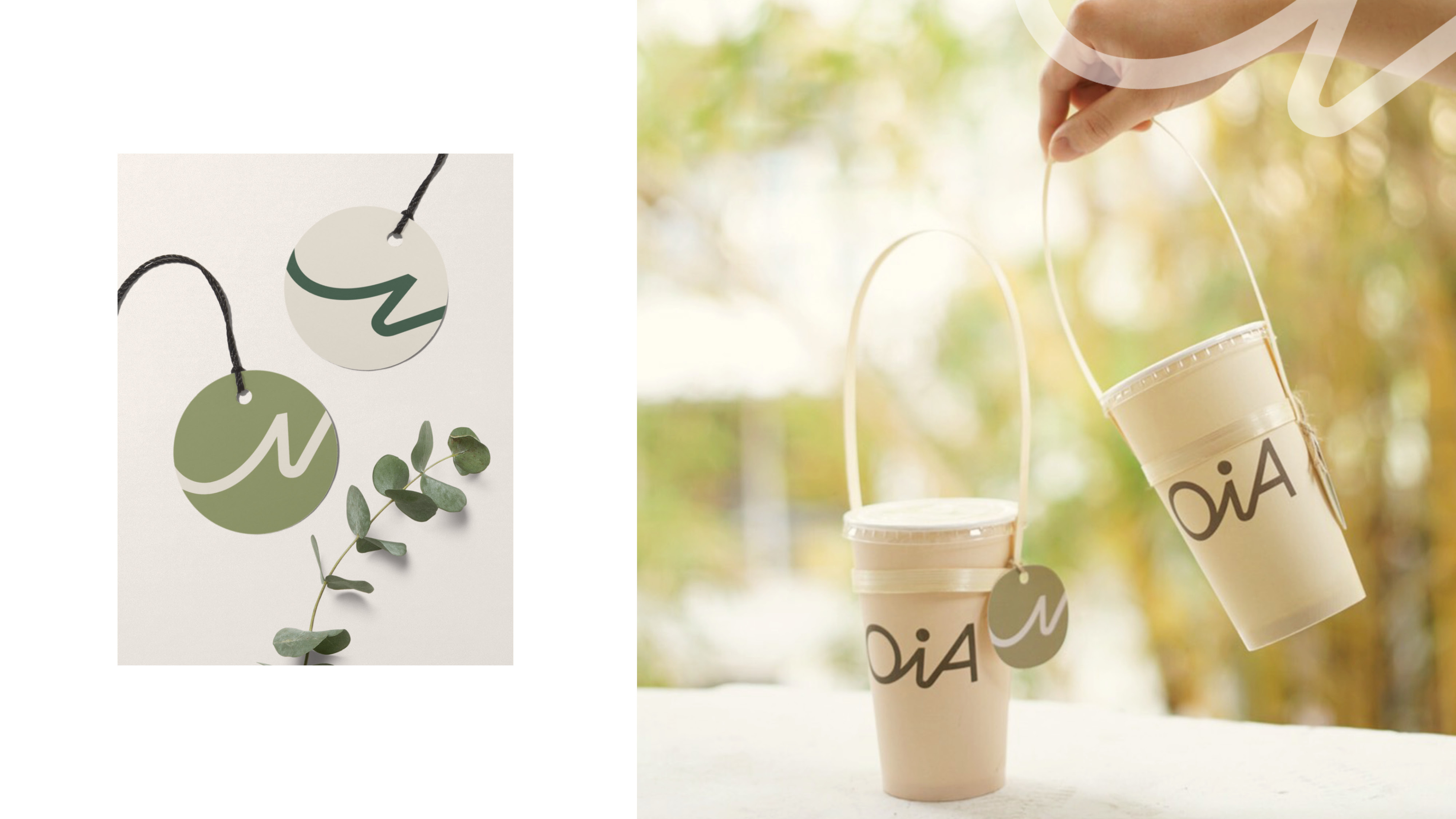
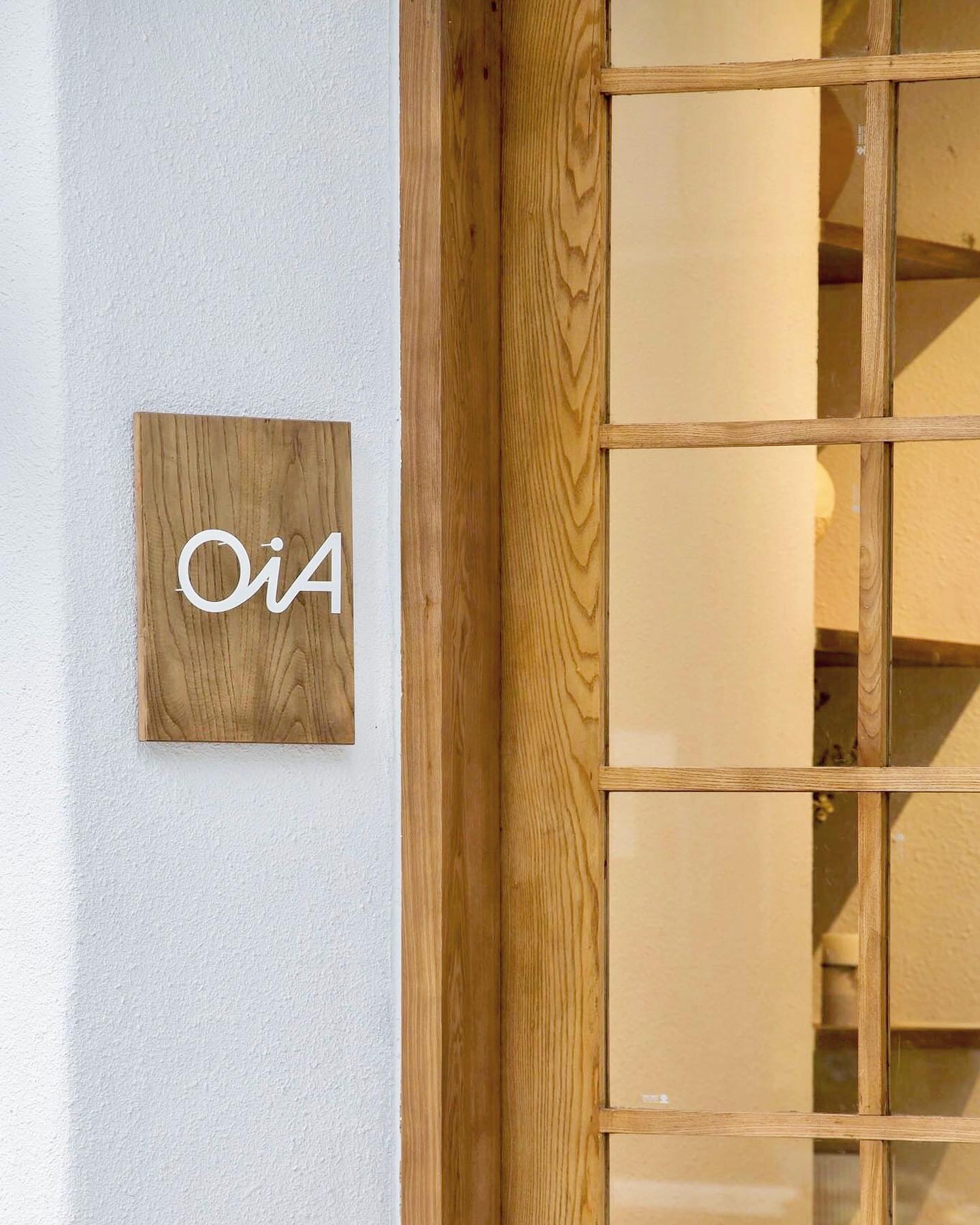
The logotype resembles clean handwriting, and the icon was designed to look like a signature. I wanted OiA to leave a lasting impression on customers, like a handwritten note from a loved one before they depart.
Graphic System
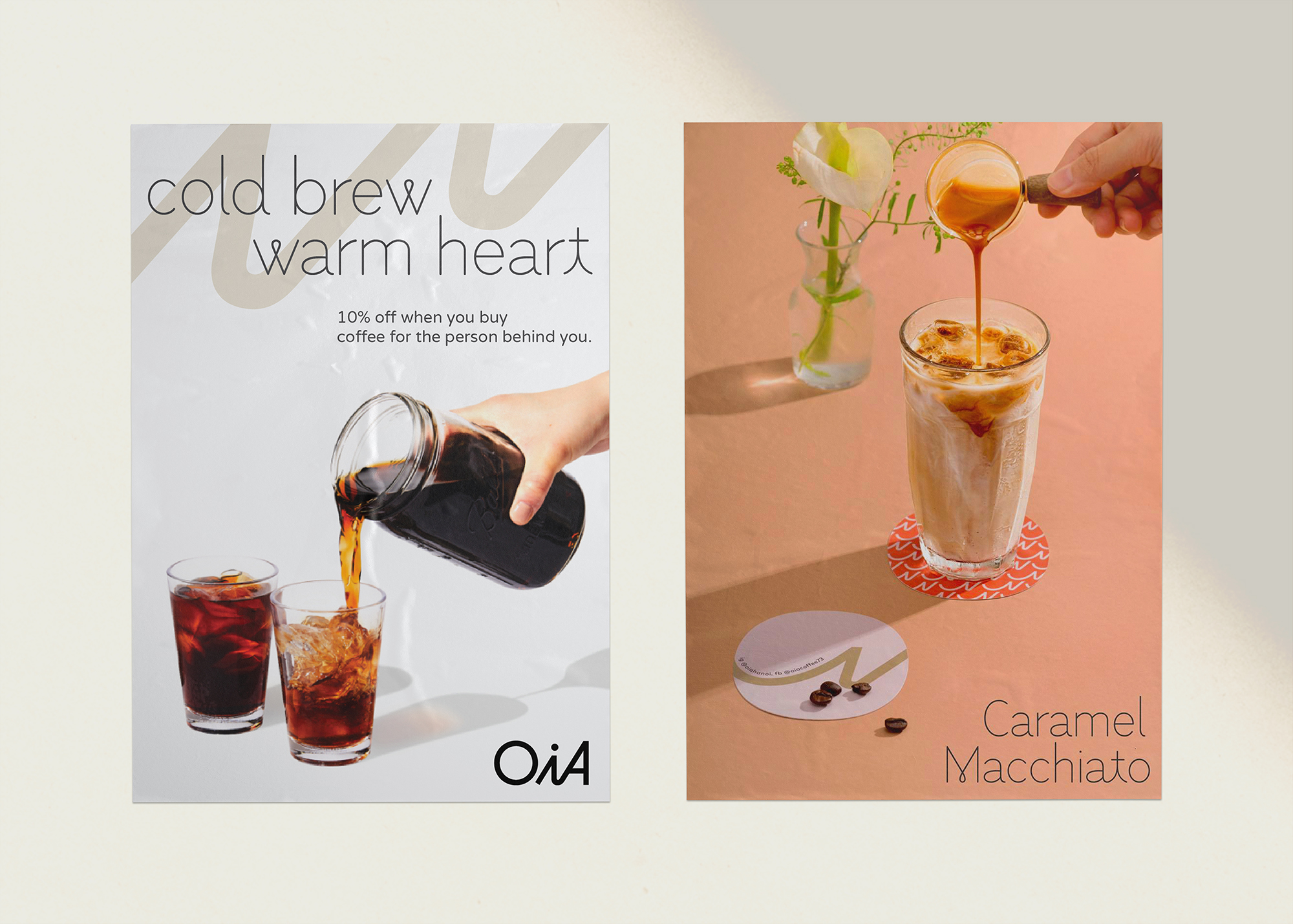
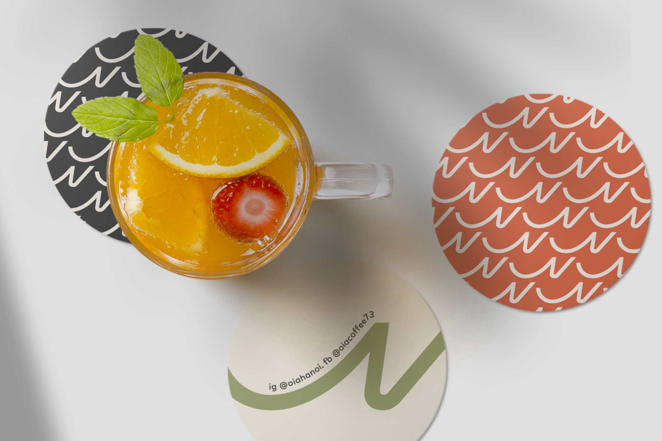
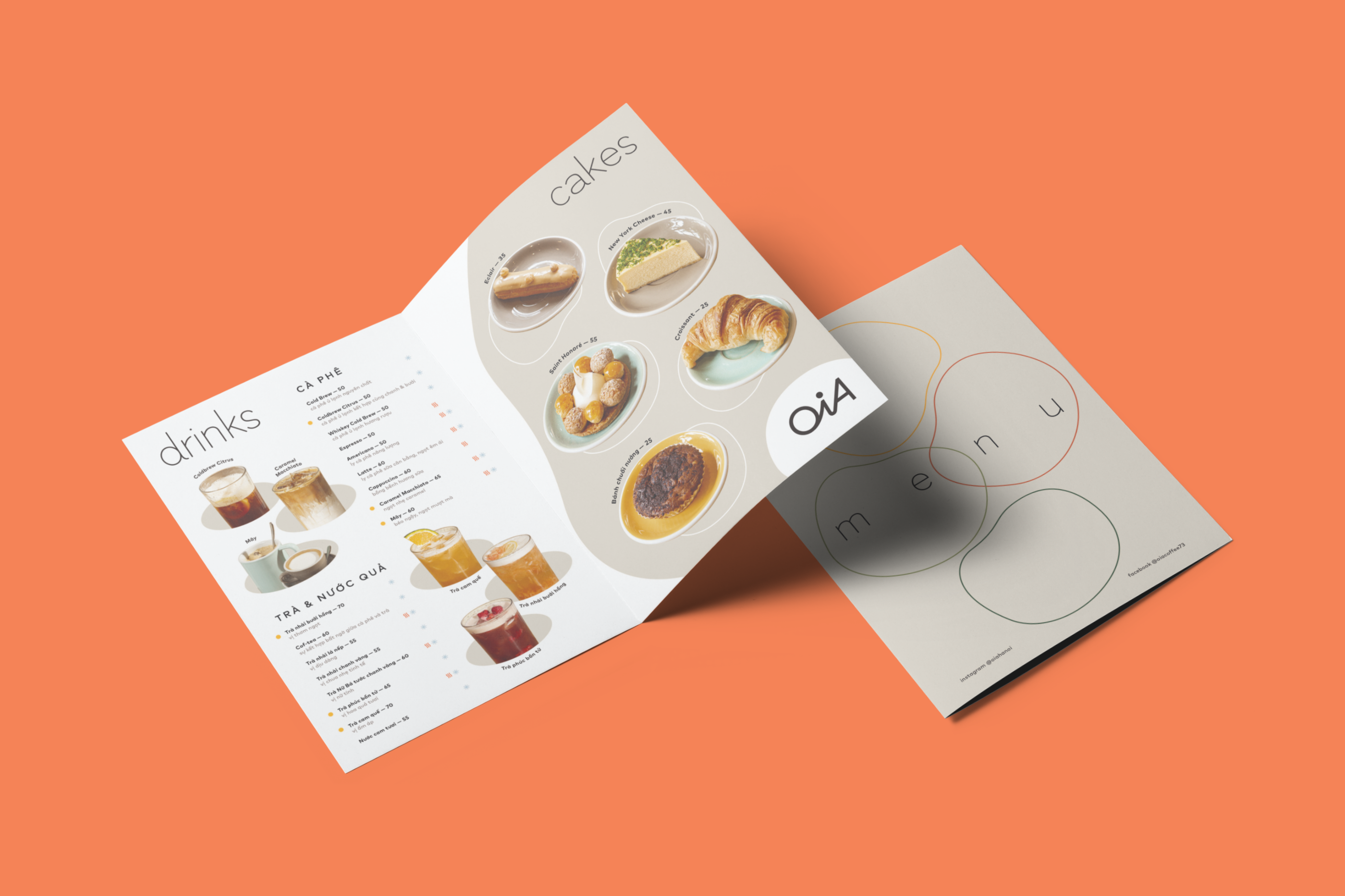
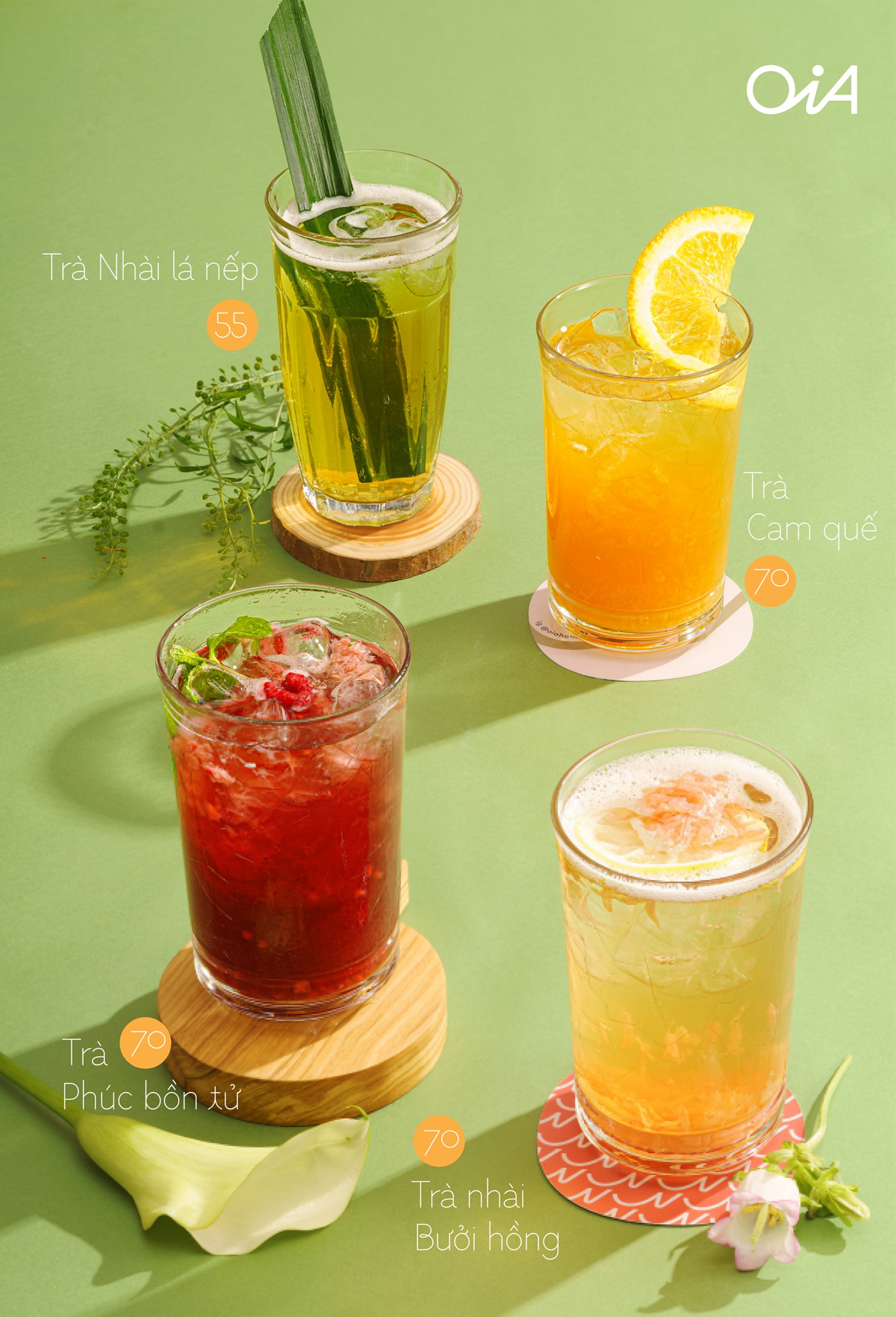
OiA’s color scheme is kept neutral to match the cafe interior, with additional pops of color to stimulate tastebuds.
I built the pattern from the icon with the intention of mimicking diary entries, or long scribbly notes to give OiA an endearing feel.