I shape brands, sandbox systems, sharpen experiences, and drive measurable growth.
Leading design for auth0.com @ Okta.
Previously Art Director @ Endy.
︎︎︎ Read more
︎︎︎ Behance
Selected Works
︎︎︎ Resume
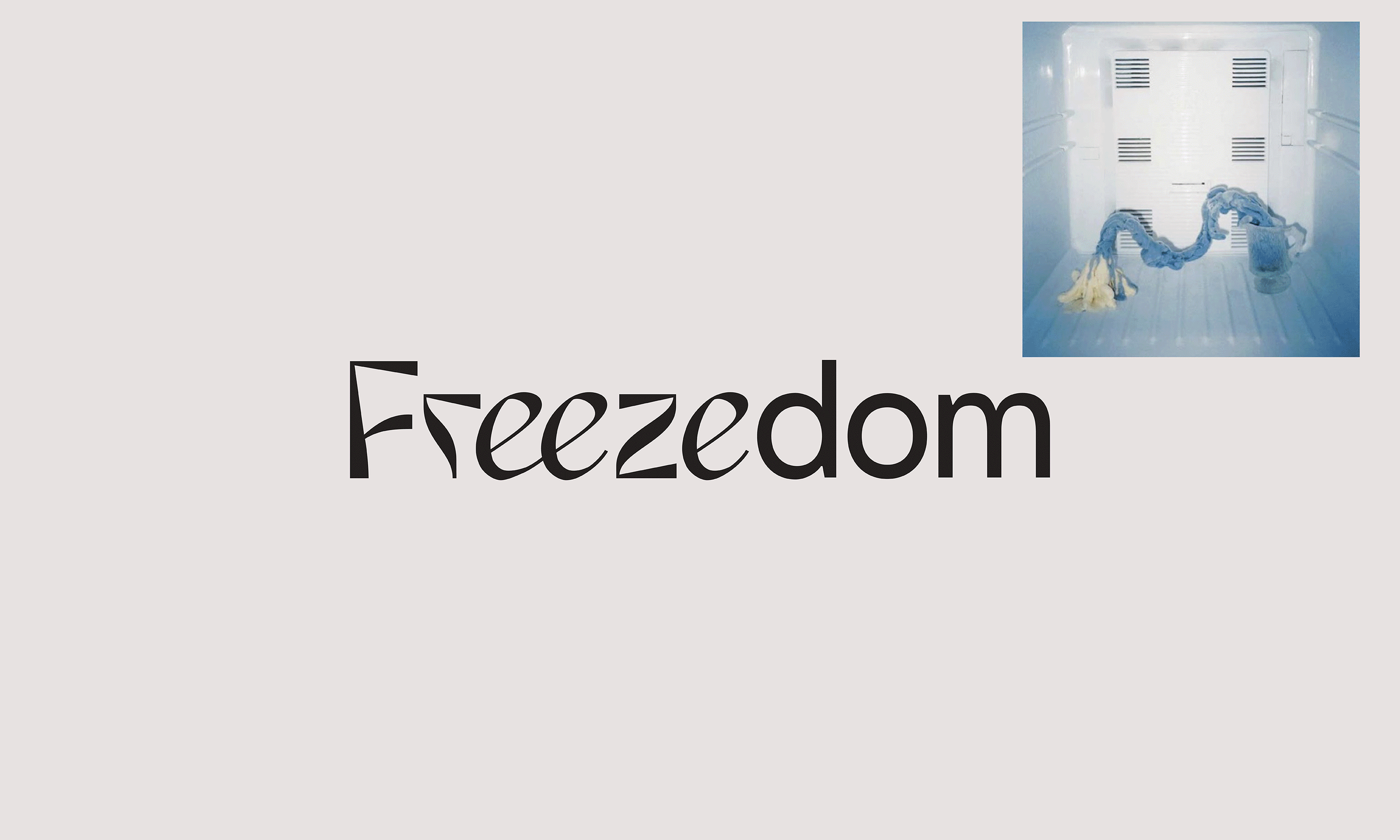
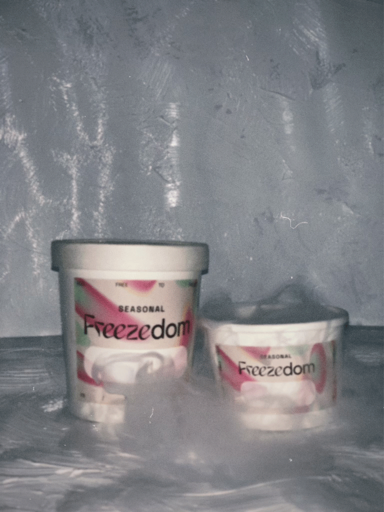
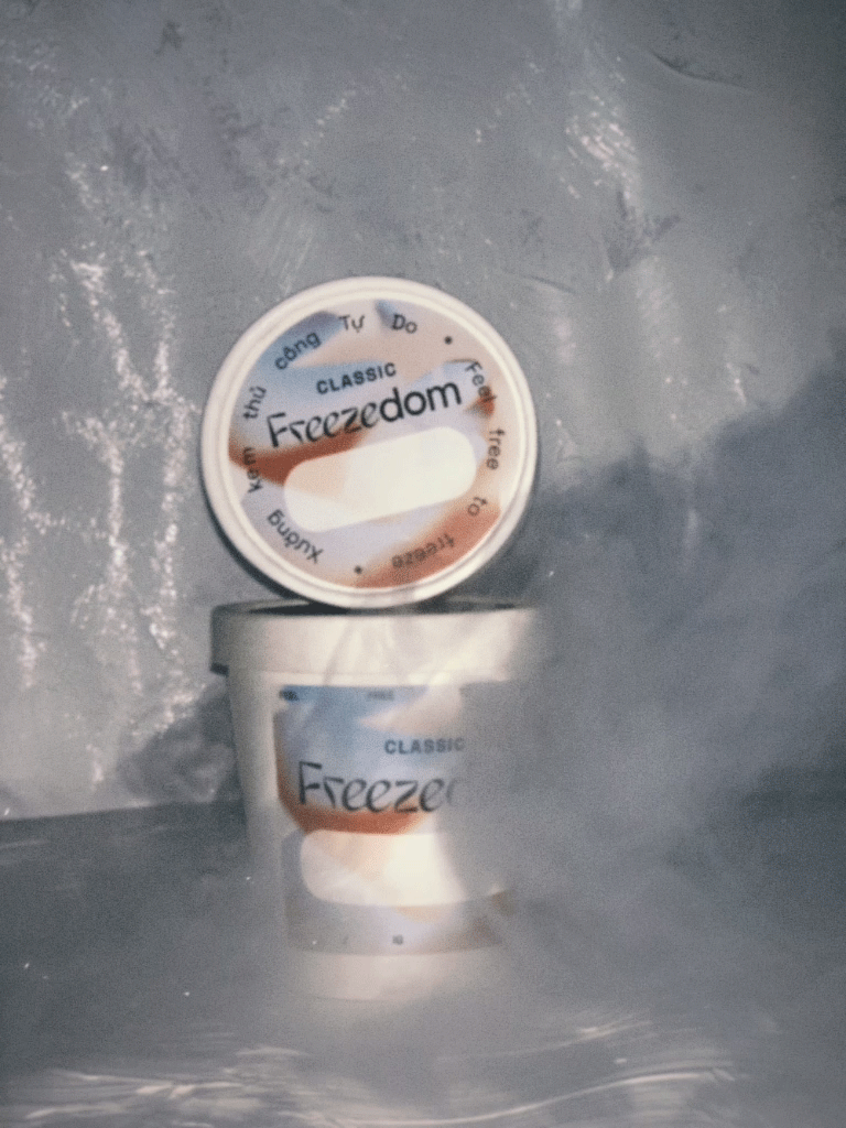
Freezedom
Freezedom is a fresh face but a game-changer in Vietnam’s dessert scene. An independent and experimental ice cream shop run by artists /slash/ taste revolutionists, Freezedom brings different sensory experiences to the table. When the brand’s not perfecting classic flavors from scratch with locally sourced ingredients, they make ice cream that tastes like metal and Indonesian cigarettes. Never the same menu, never the same palate, never stagnant. Living up to its name, Freezedom pushes the boundaries in dessert artistry, with ice cream as its chosen medium.
Creative Direction
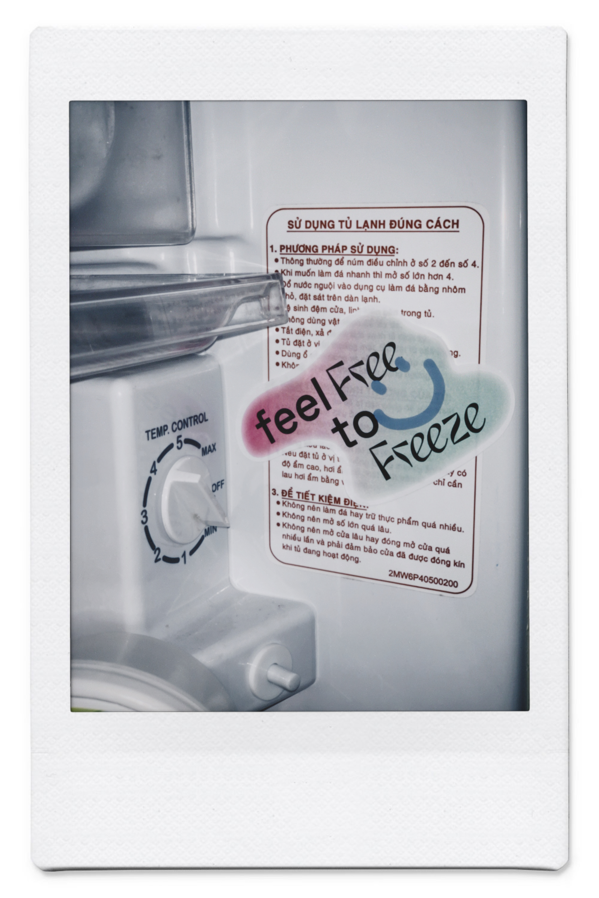
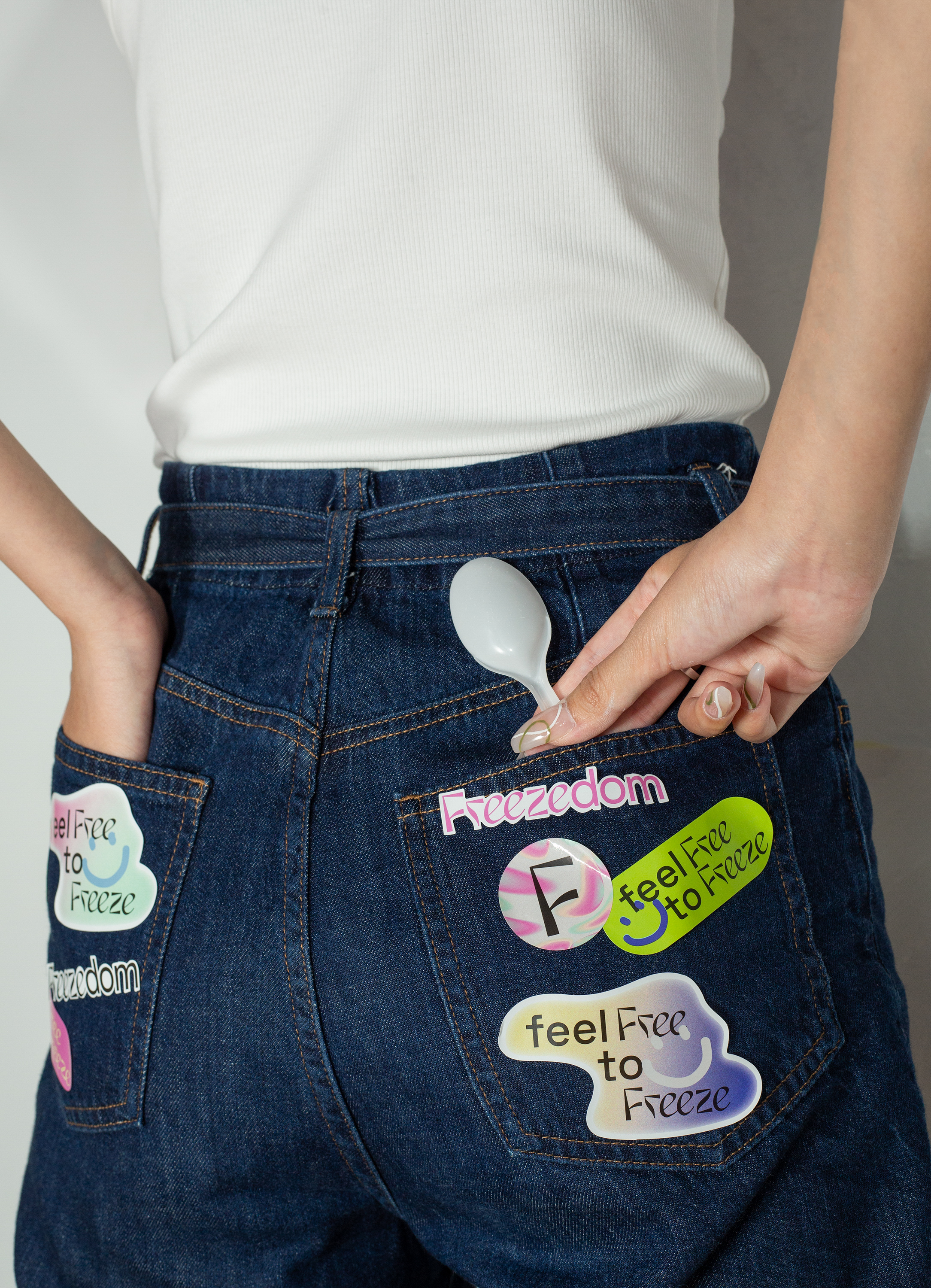
I built Freezedom’s identity system around synesthesia to translate the thrill of taste into visuals. Eclectic, free-flowing, unapologetically eye-candy. A brand story as bold as the flavors.

Graphic System
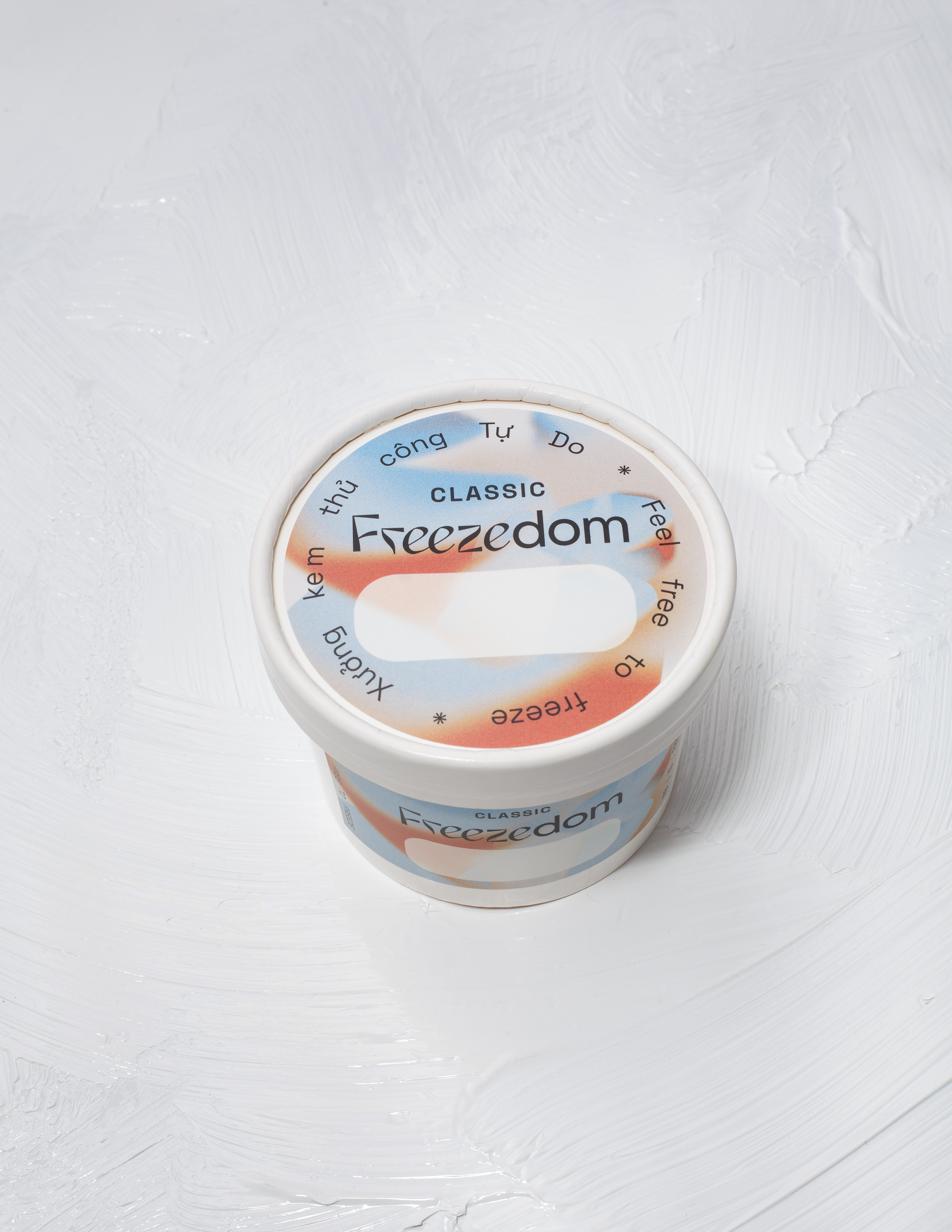
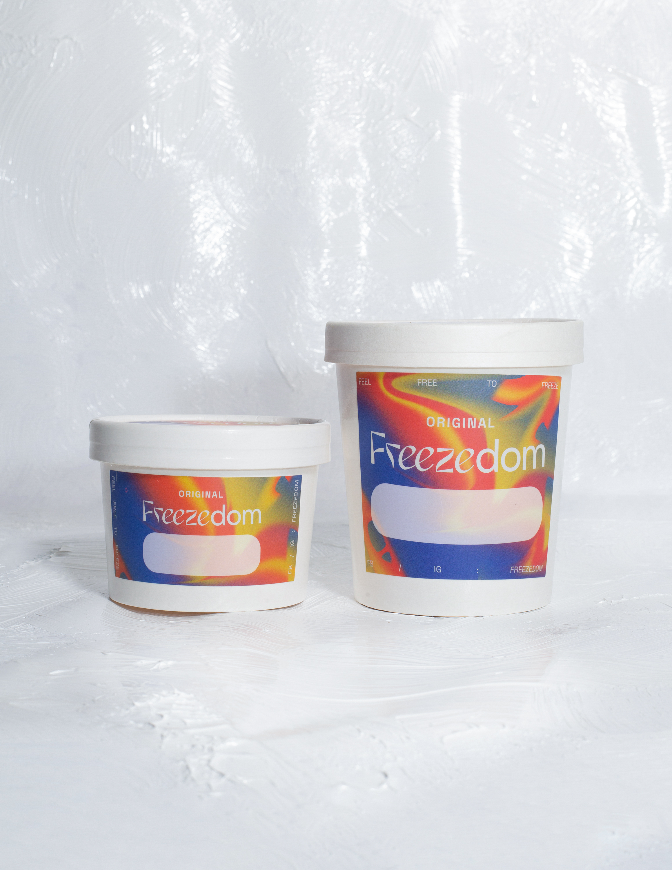
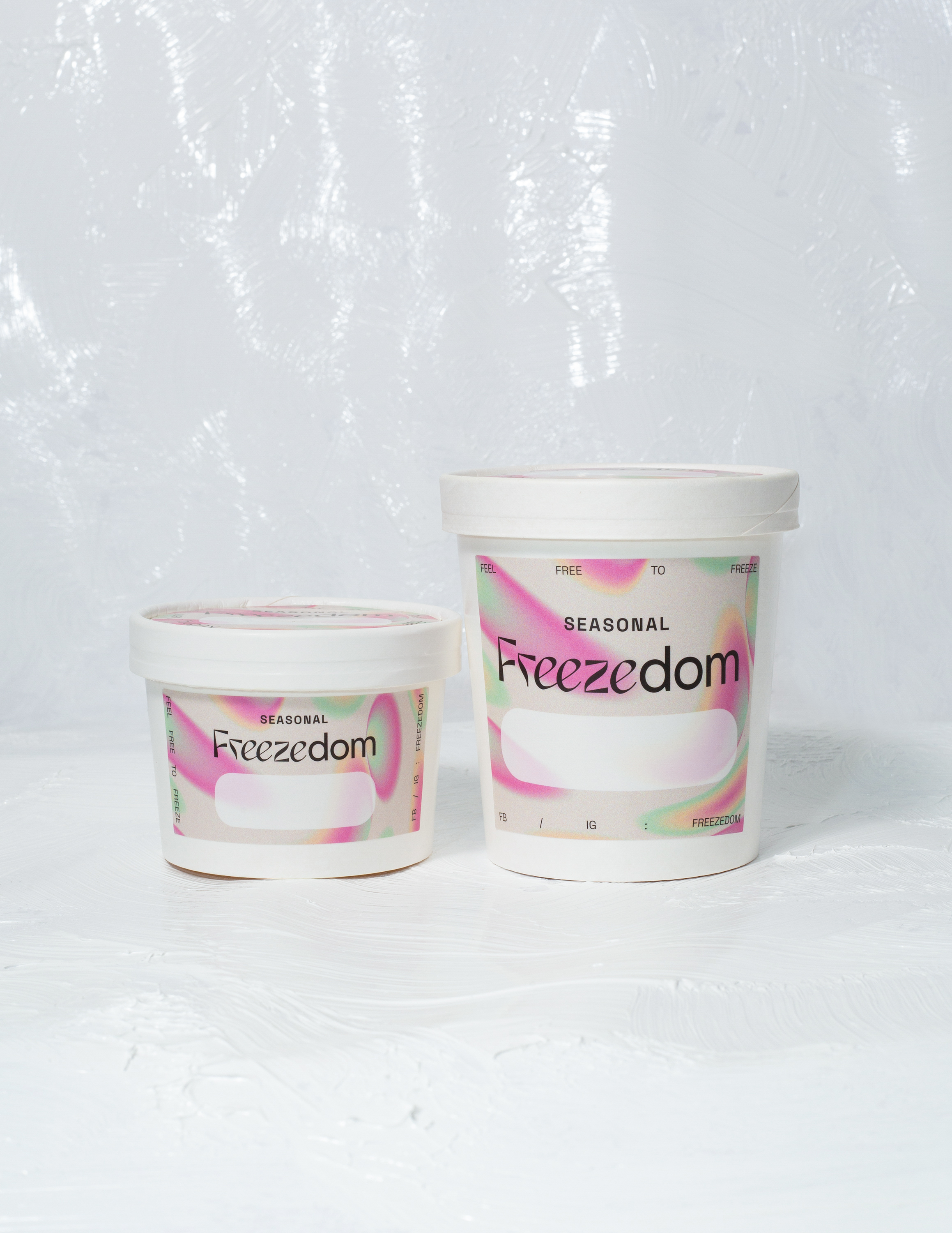
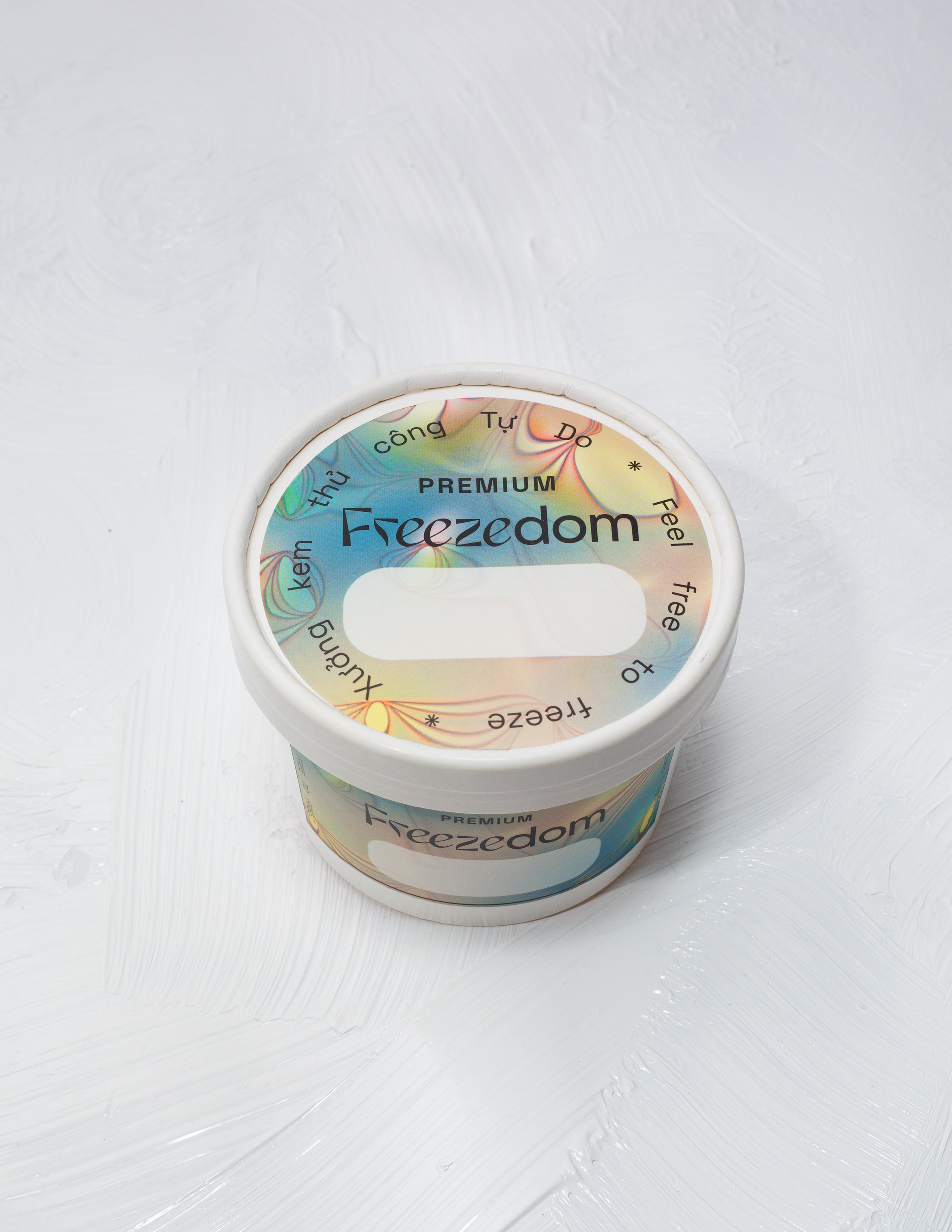
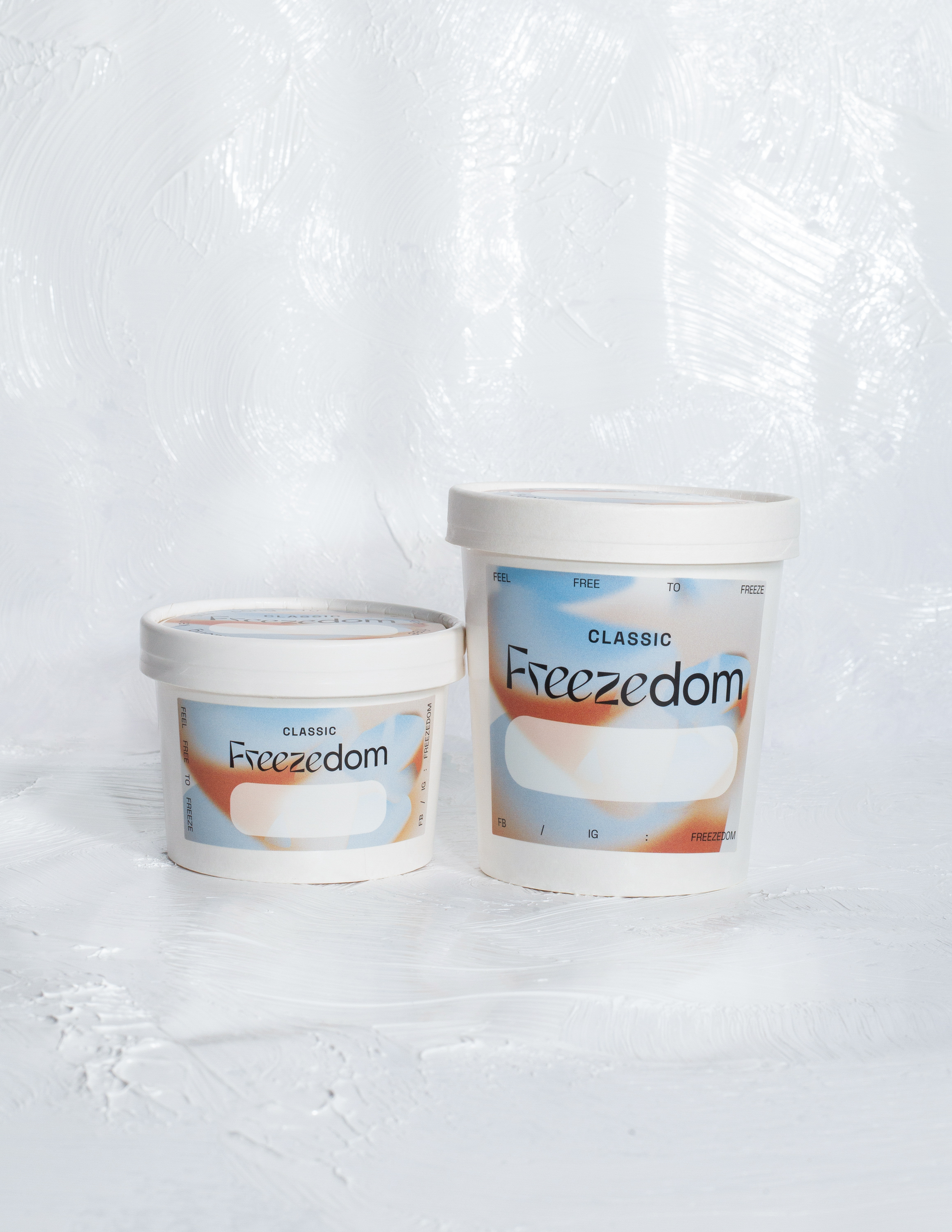
The logo pairs a custom groovy type with a clean sans-serif—a visual handshake between experimentation and refinement, a balance echoed in Freezedom’s polarizing flavor lineup.

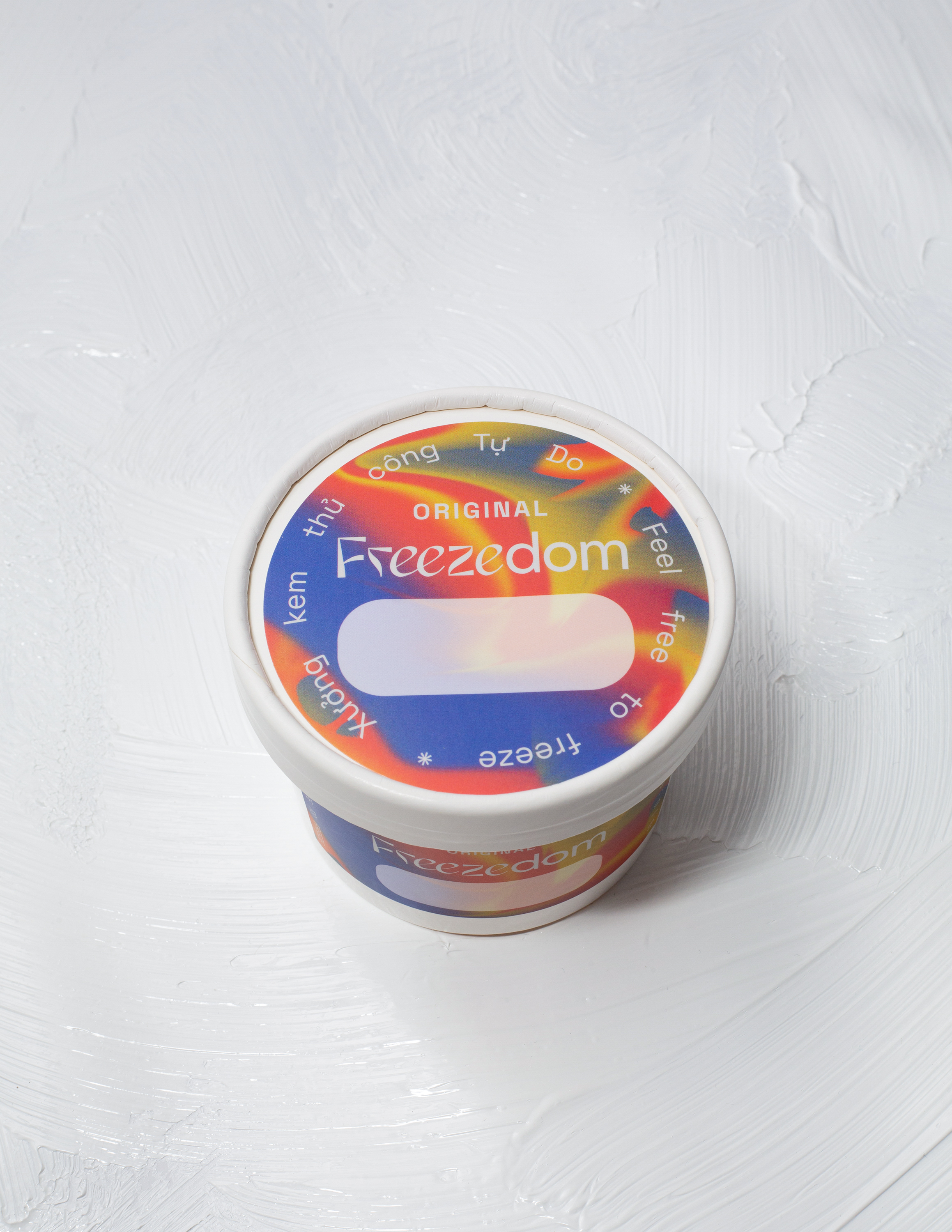
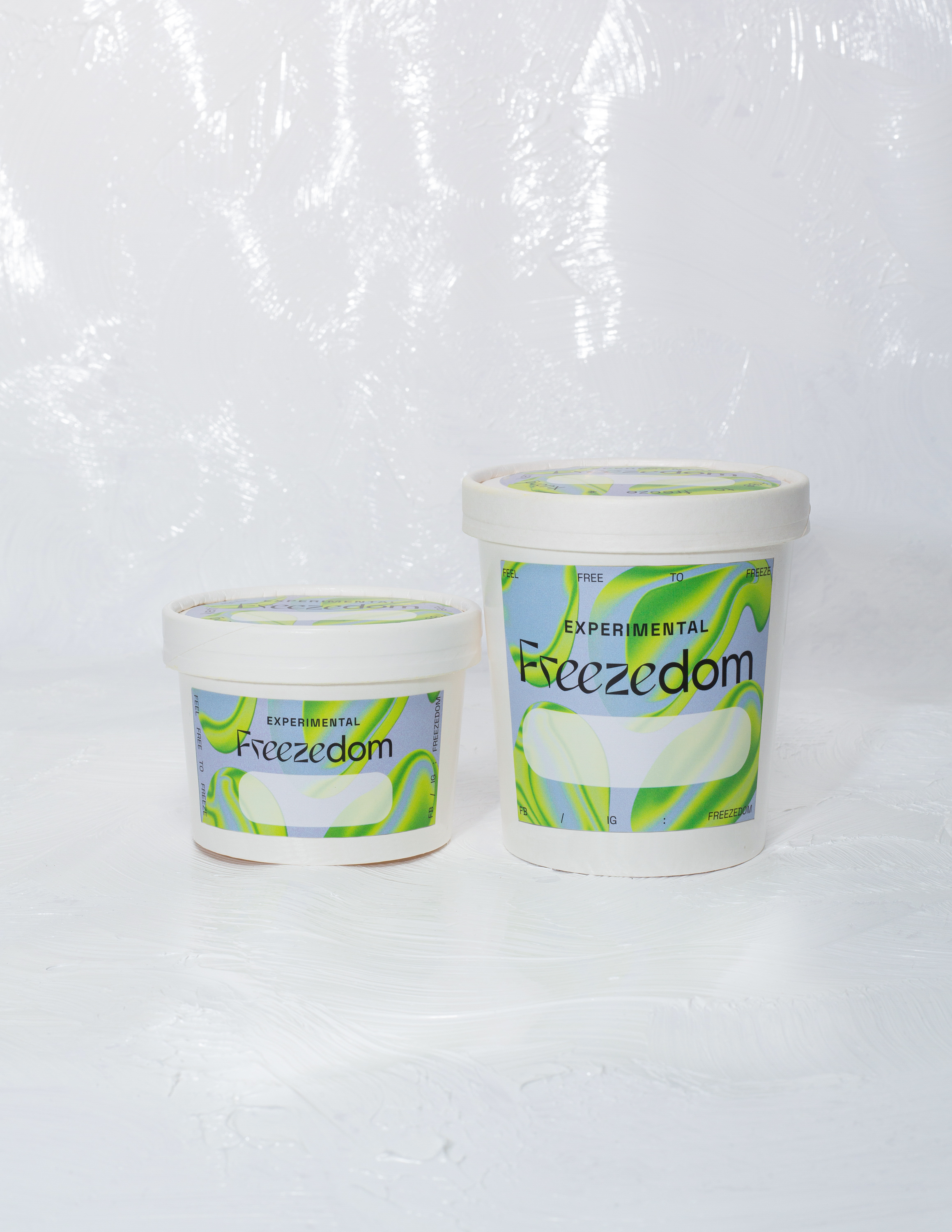
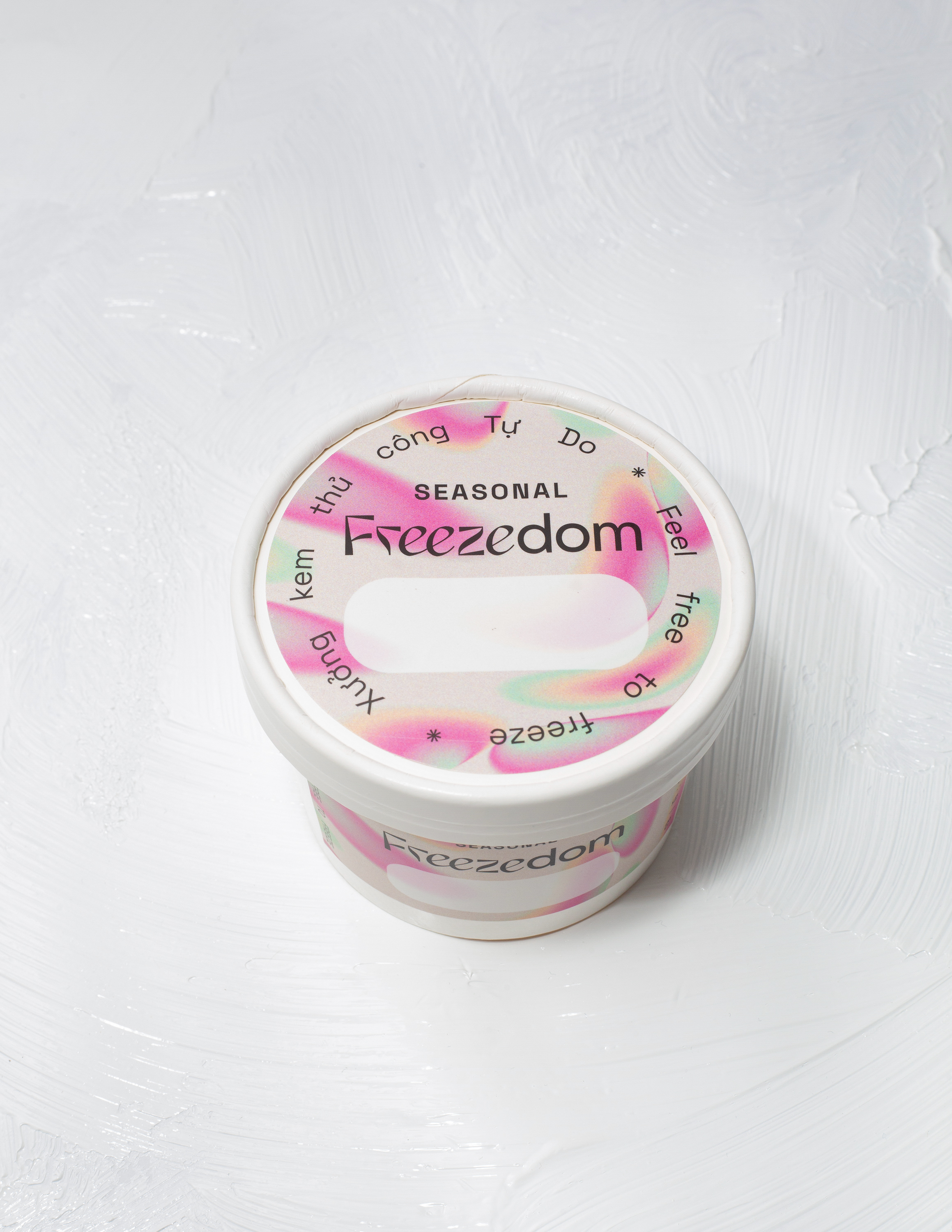
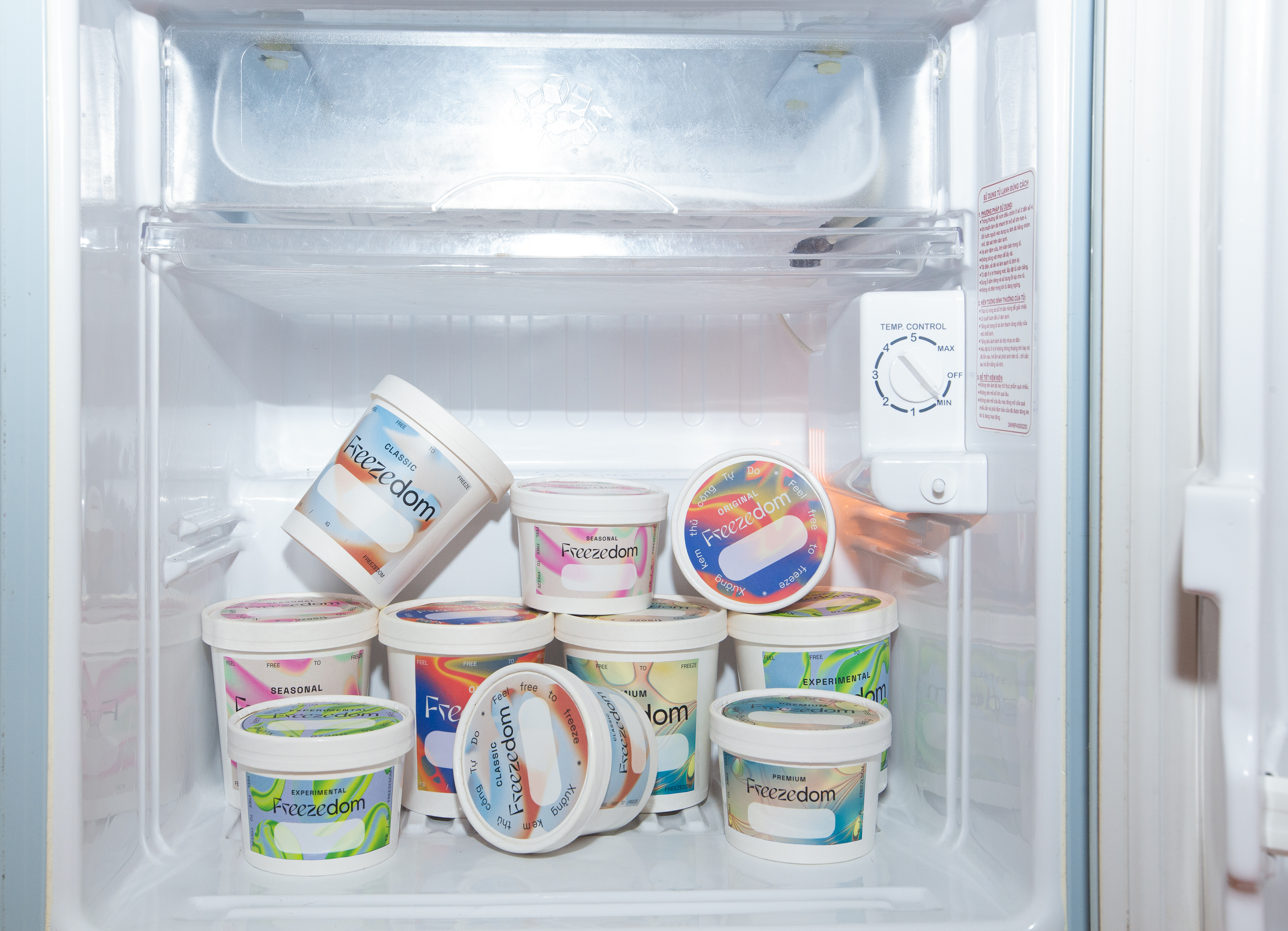
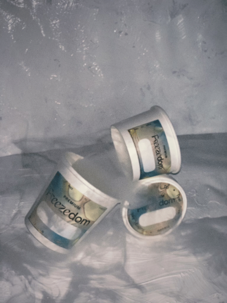
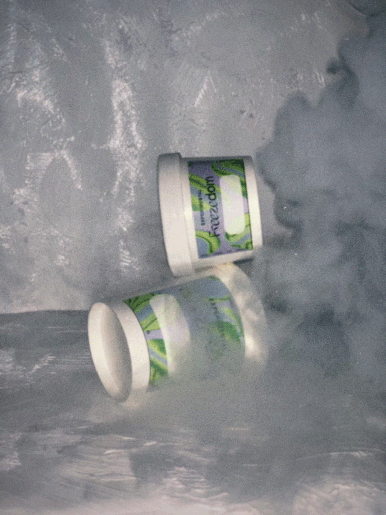
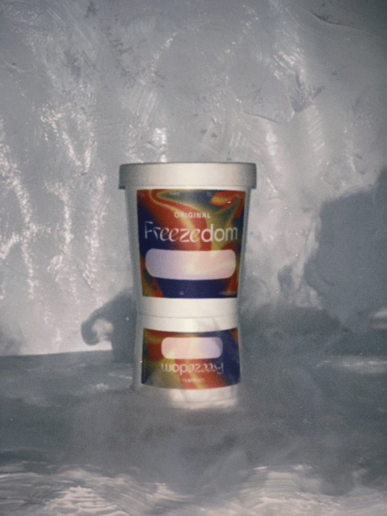
Each of the five product lines gets its own synesthetic artwork and colour palette, giving every flavor a signature look while creating a bold, repeatable graphic motif for the brand.

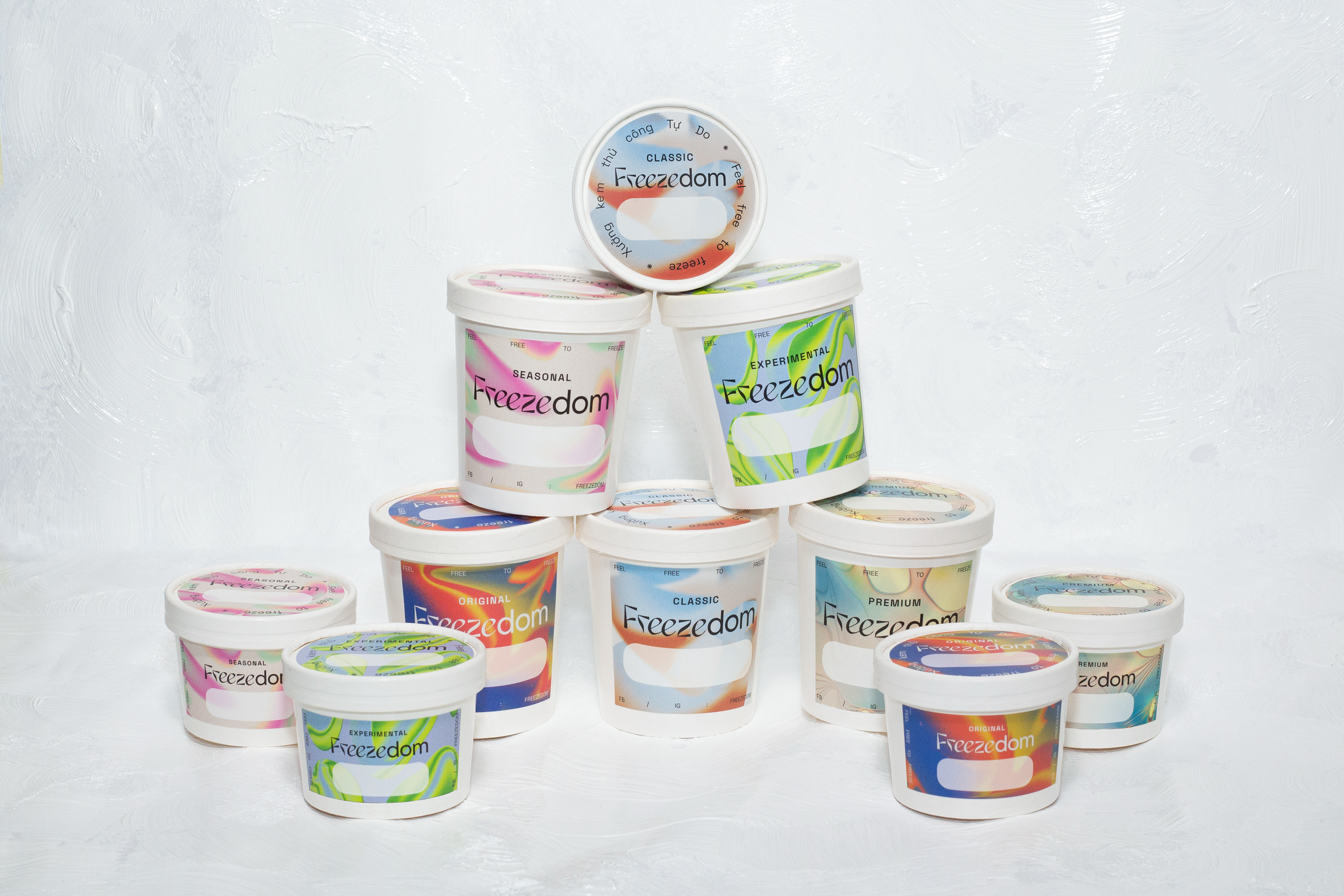
Packaging labels with a designated area for writing flavour names, as Freezedom’s menu changes daily